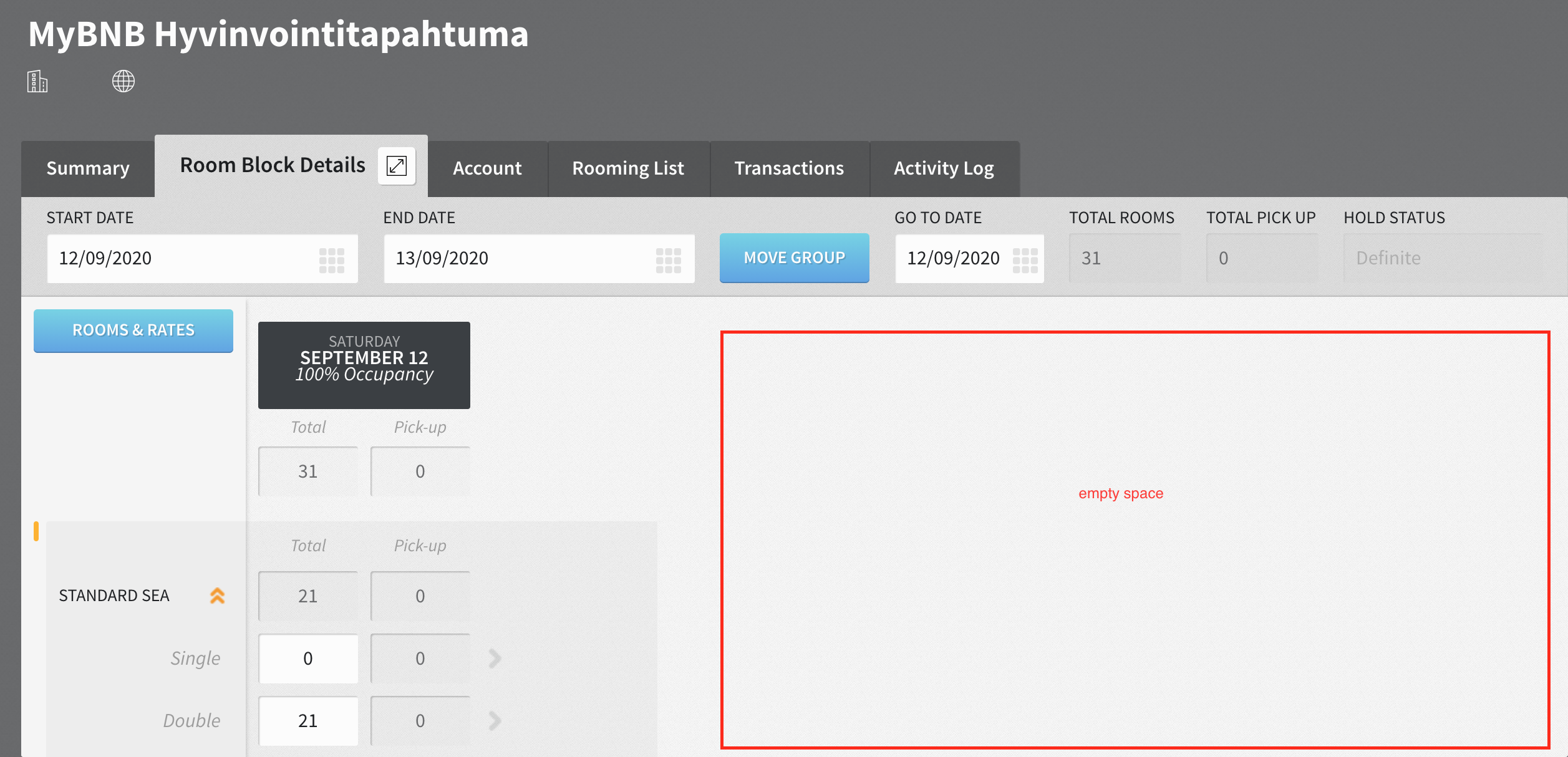
Room block details screen
3 CommentsSorted by Oldest First
Is it possible to remove the Triple and Quadruple lines are have it as an optional for a cleaner look.
Hi Nina,
Maybe not a huge improvement but if you click on the little square with the arrows to expand next to the word 'Room Block Details' on the tab it will go into full screen mode which should help a bit.
The space on the right is obviously for additional days. I will see whether there is any way to improve the screen design but hopefully the full screen mode will help a little..
Thanks,
SNT Product Team
I think if you made the interface not as tall so you could see more room types for each date at once without having to scroll down it would be a lot more user friendly.

2 people like this idea
Hi,
I was just wondering if it would be possible to have overview at once also on laptop screen on the room block details instead of scrolling in a small window to check which rooms types are blocked. There is lot of space on the right to spread the view nicer and more user-friendly.

Best regards,Nina